These are the colours we have discussed and found examples in advertising for.
Now we will be making our own symbolic examples of what these colours represent.
It does not need to be a wheel since black, grey, white, brown, and pink do not fit into a standard colour wheel. So that means it can be whatever shape you want.
The point of this project is that you are creating examples showing you understand that certain colours represent specific things and being creative as possible.
Avoid examples where colours represent the actual thing itself.
purple-grapes
yellow-lemons
green-apples
etc
Instead
You are looking to represent the abstract concepts like danger or peace.
Gimp Projects:
|
Create a 6 colour wheel (red blue yellow green purple orange) using the colourization technique in gimp.
|
|
|
Assignment: Create Your own collection of colour ADVERTISEMENTS.
etc
Find examples of advertisements that use colour symbolism effectively.
This is a reflective project on the subconscious use of colour in our daily lives. Projects that show a thoughtful connection between this project and the real world will do best.
Each ad should have a short explanation of why you think the graphic designers chose the colour they did. Remember: The creators could have picked any colour they wanted but they made those colour choices for a reason. Explain what you think those reasons where. Guiding questions: Why did you feel this advertisement was effective? Would the message change if they had picked a different colour? Can you think of another example where it is common to see the colour? etc.
Complete your assignment and make is accessible on your Weebly site. I will mark it from there.
Project is due: Friday Oct 16th by the end of the school day.
You will be assessed on:
Your ability to explain your choices. Is it thoughtful? Is it a complete explanation which answers the question why was this colour used?
Do you have answers for each colour?
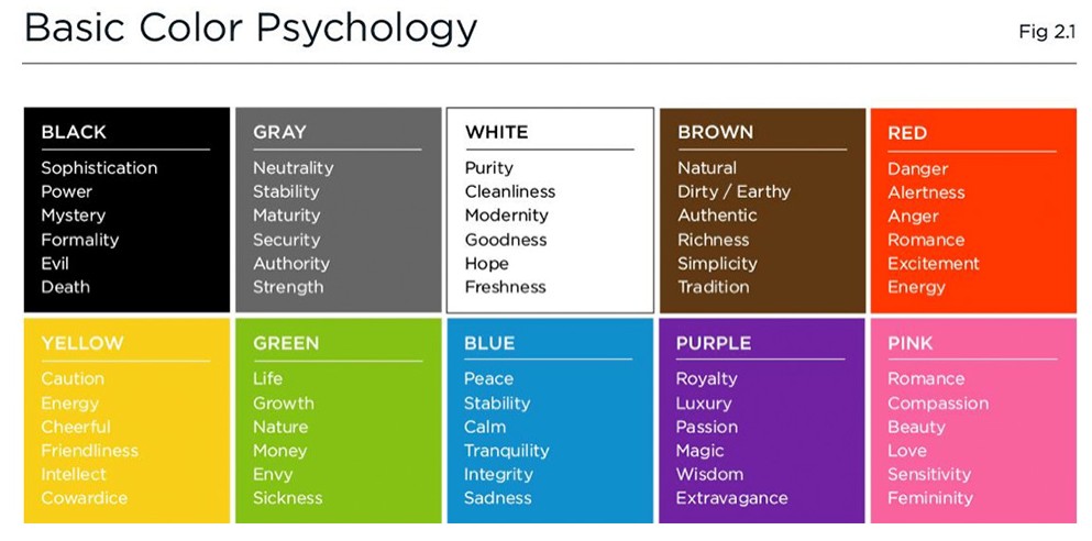
You need to include an example for all the colour selections found on the chart below.
Find examples of advertisements that use colour symbolism effectively.
This is a reflective project on the subconscious use of colour in our daily lives. Projects that show a thoughtful connection between this project and the real world will do best.
Each ad should have a short explanation of why you think the graphic designers chose the colour they did. Remember: The creators could have picked any colour they wanted but they made those colour choices for a reason. Explain what you think those reasons where. Guiding questions: Why did you feel this advertisement was effective? Would the message change if they had picked a different colour? Can you think of another example where it is common to see the colour? etc.
Complete your assignment and make is accessible on your Weebly site. I will mark it from there.
Project is due: Friday Oct 16th by the end of the school day.
You will be assessed on:
Your ability to explain your choices. Is it thoughtful? Is it a complete explanation which answers the question why was this colour used?
Do you have answers for each colour?
You need to include an example for all the colour selections found on the chart below.
Example of a solid explanation.
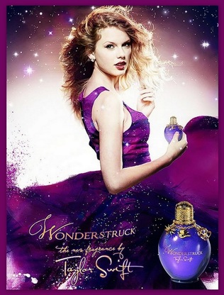
In this advertisement for perfume the predominant colour is purple. I think that they are trying to convey the feeling of luxury and magic. The feeling of magic is created by the colour purple they have picked it is a deep twilight purple and the way they have sprinkled glitter in with the purple both on her dress and the background makes me think of a galaxy or twinkling sky. The graphic artists have also worked on the purple of her dress and blended multiple colours of purple to make it look vapourish which makes me think of magic potions. The magic and luxury is also repeated in the choices made for the bottle. Gold and purple are a definite luxury colour combination and makes me think of royal crowns. The design of the bottle also could make you think of a potion bottle especially since it has the little charms on it.
The perfume is called Wonderstruck and they way the light is framing Taylor Swift it could easily look like a spot light, as in we are wonderstuck by the fabulous Taylor swift. But with the colour purple and the sparkle they used it makes me feel as if that is not the concept. I think the designers are trying to make us think of Taylor as a magical fairy instead of a superstar in a spot light and the key to that feeling is the purple.
The perfume is called Wonderstruck and they way the light is framing Taylor Swift it could easily look like a spot light, as in we are wonderstuck by the fabulous Taylor swift. But with the colour purple and the sparkle they used it makes me feel as if that is not the concept. I think the designers are trying to make us think of Taylor as a magical fairy instead of a superstar in a spot light and the key to that feeling is the purple.
Just a pass Explanation.
In this advertisement for perfume the main colour is purple. I think that they are trying to convey the feeling of luxury and magic. I think the designers are trying to make us think of Taylor as a sparkly fairy. The colour purple they have picked is a deep twilight purple and the way they have sprinkled glitter in with the purple both on her dress and the background makes the image look kind of magical.
